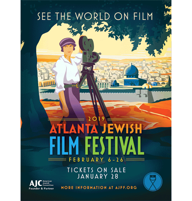
Atlanta Jewish Film Festival
Branding, Design & Illustration for 2019
It was our second year to design the creative campaign for the Atlanta Jewish Film Festival. Inspired by the large amount of films from around the world that are presented during the festival, for 2019 we developed a vintage travel poster theme.
We redrew classic travel poster backgrounds dating as far back as the 1900s, then illustrated new film related "characters" to occupy the landscape.
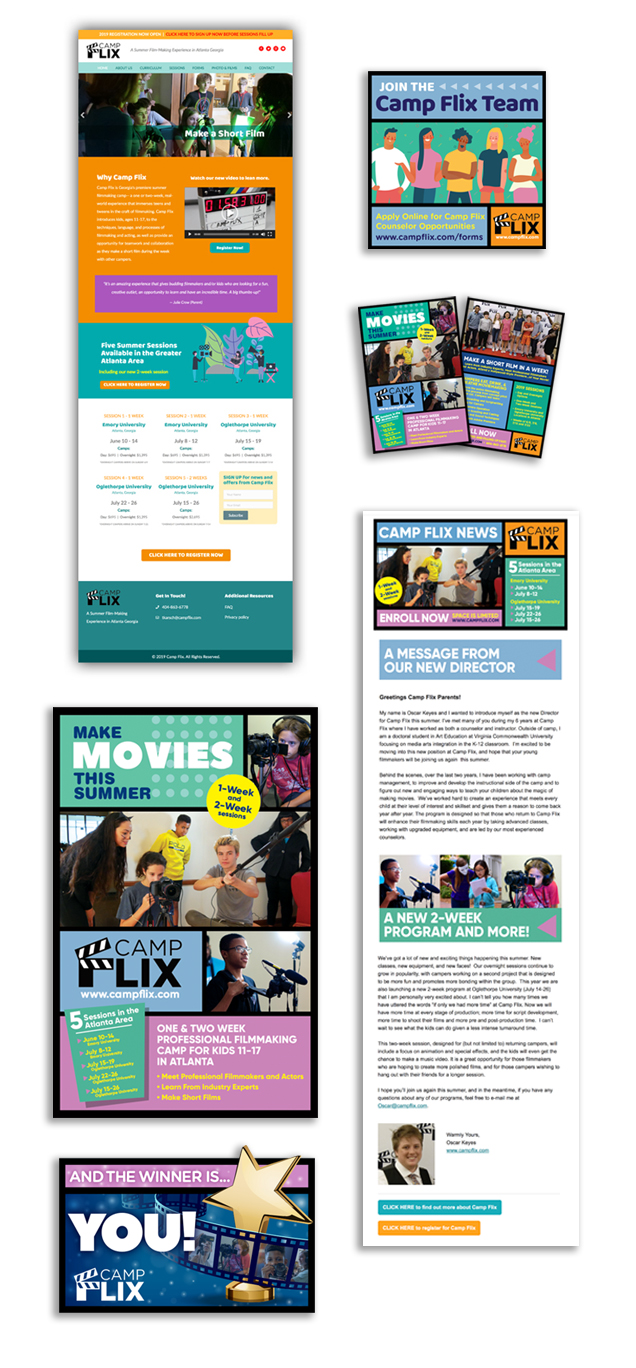
Camp Flix
Branding Mashup: Mondrian meets Memphis
Not all branding is a big picture project. Sometimes it’s an evolution using a website redesign as the foundation. But to do it right, you need to have the chops to create something with a unique voice, yet the ability for visual design system to be applied to other media and formats.
For Camp Flix, the initial scope of the project was a website refresh. Yet, their current UI was out of date and needed more than just an update. Many of the sites we create are product landing pages with unique restrictions that require them to be hand-coded. But this was the perfect project for us to use WordPress as the CMS along with a modern page-builder plugin to make it easy for the client to update.
From the start we knew creating a site with a visual design that is fresh, yet professional was critical. The aesthetic also needed to be transferable to future marketing efforts such as online advertising, email marketing, newsletters, postcards, and posters. Furthermore, it needed to be both cool for kids to get excited about the camp, yet professional enough for parents to take it seriously.
To make the Camp Flix brand both fun and serious, we created a structured, modular system of blocks with black dividers, similar to a Mondrian painting, combined with playful 1990s Memphis-style shapes and colors.
Our type choices follow the similar design principles. Simple bold fonts were chosen for impact and legibility. But despite the type being very bold, their round, open shapes used in light colors still creates a bright, friendly user experience.
Existing photography taken at the camp is in important feature in telling Camp Flix's brand story. But instead of relying solely on the photography to tell that story, we complimented it with modern, stylized illustrations. These unique illustrations communicate more abstractly, while creating a memorable aesthetic. The same style is used for icons and informational graphics on the site. The friendly, memorable style of these illustrations, help differentiate Camp Flix from other summer camps.
If you have kids interested in film-making, or they're just creative in nature, this camp is perfect for them. Check out their site at www.campflix.com.
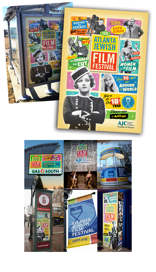
Atlanta Jewish Film Festival
Branding & Design for 2018
It was both exciting and an honor to design the creative campaign for the 2018 Atlanta Jewish Film Festival. Our biggest challenge was to communicate a large amount of information about the depth and diversity of the festival in an exciting format that would appeal to the existing AJFF audience as well as new audiences.
Inspired by vintage concert posters, especially those produced by the Globe Poster Company between the 1950s and 1980s, our solution allowed us to create complex, colorful, dynamic art that playfully demands attention and draws the viewer in. The nostalgic style also capitalizes on current design trends popular with 20-30 year olds, as well as connecting with the 30+ markets familiar with the original look.
Becoming part of the visual fabric of a community is always something desired by artists and designers. But to have it be attached to such an amazing event gives it special meaning. Using the power of film to not only entertain, but to educate, create bridges, and open dialog across cultures makes the world a better place for everyone. Persuasion Bureau is proud to be part of this worthwhile vision of hope.
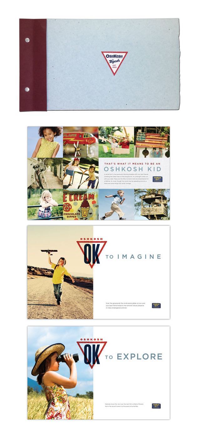
OshKosh B'Gosh
Branding Insights
Often a brand needs to reinvent itself to connect with consumer's evolving tastes. Oshkosh B'gosh has been around for over 100 years and was nearly a household name, but they had drifted from their path. Instead of the heritage, quality, and affordability that once embodied the core of the brand, they had become to a mass-market clothing discounter. It was time for a change. We partnered with their internal marketing team to explore how their brand could engage with consumer's current tastes. The timing couldn't have been better. Parents we're shifting away from deep discounters to more "authentic" brands. Oshkosh B'gosh's 100-year heritage, quality products, and excellent price points were a perfect fit for this changing market.
Featured: OshKosh B'gosh rebranding strategy and look-book.
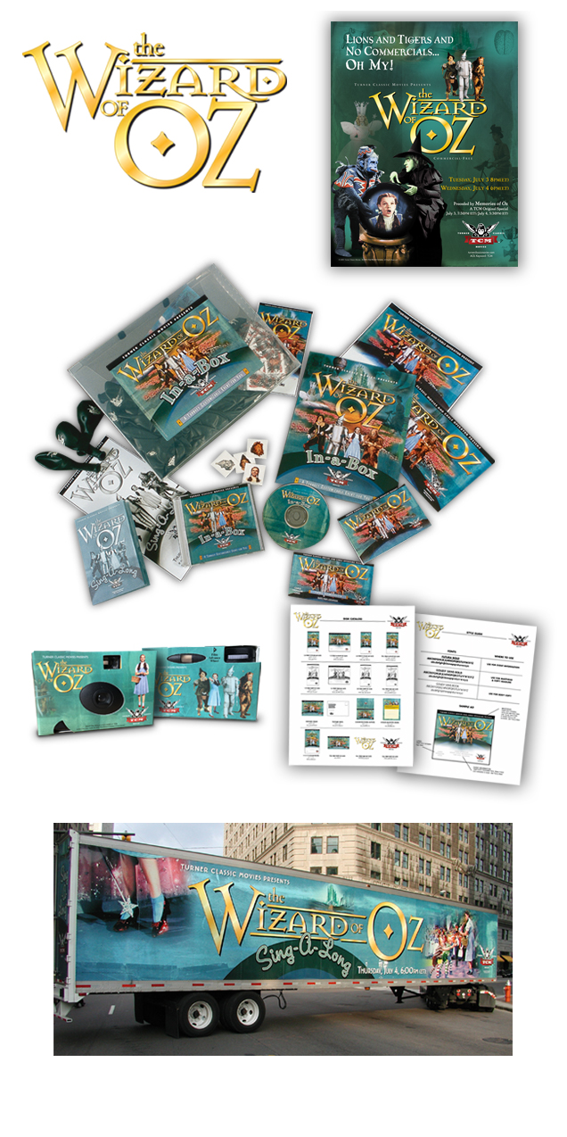
Turner Classic Movies
The Wizard of Oz
It's hard to believe that The Wizard of Oz was beginning to drift into obscurity. What was once a yearly springtime television event rarely played on television by the late 1990s. Sure many people knew the classic lines and scenes, but many adults hadn't seen the film in years. Worse yet, kids never had the chance to be terrified by flying monkeys. It took the visionaries at Turner Classic Movies to reintroduce adults and families to this classic film with a touring outdoor screening and an on-air event.
We were hired to develop an updated look for the film's branding and marketing. From a new title treatment for the movie to more modern marketing materials, we updated the film for a new audience. We even got to design a TCM "flying monkey" logo.
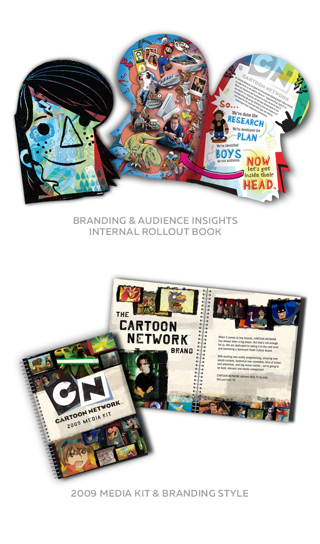
Cartoon Network
Audience & Brand Insights
As an industry leader and innovator it's important to maintain a strong connection with your core audience and discover new ways to expand other audiences.
Cartoon Network does this. And we’ve helped along the way.
We've partnered with their creative department to help develop internal brand culture guidelines, upfront materials, promotions, media kits, and PR websites.
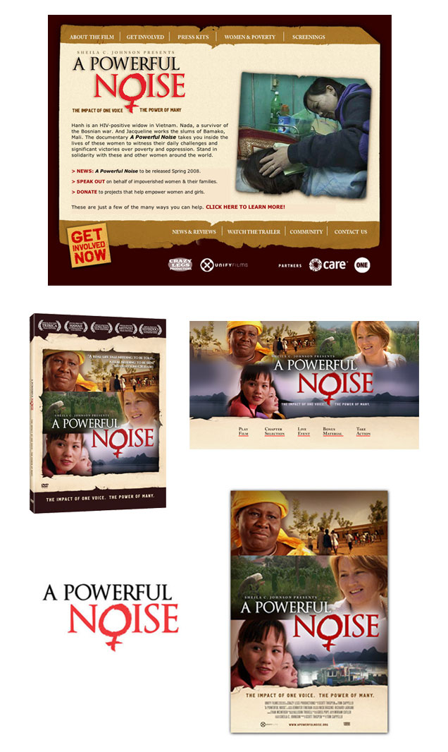
CARE
Branding and Integrated Marketing for the documentary “A Powerful Noise”
For three years we worked intensely with CARE on a world-wide marketing campaign for their movie "A Powerful Noise." We created the distinct branding along with the logo, website, advertising, education materials, DVD packaging, and movie intro/titles.
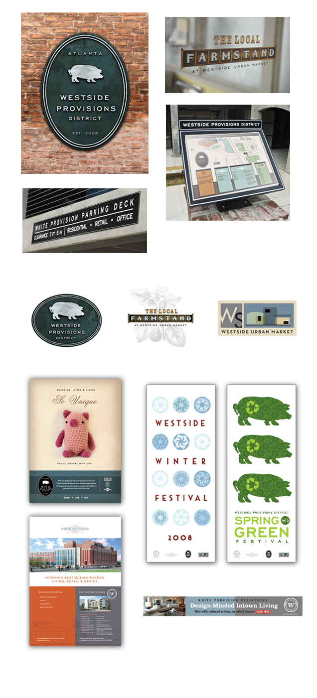
Westside Provisions District
Branding, Maps and Signways
As a design studio to be asked to "brand" the anchor shopping area of Atlanta's design district was an honor. To work directly with the redevelopment visionary Michael Philips, was icing on the cake. He and Jamestown Properties are internationally known for projects including Chelsea Market (New York City), Ponce City Market (Atlanta), and Warehouse Row (Chattanooga).
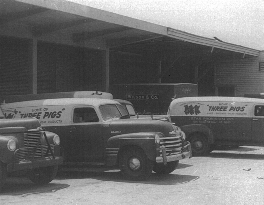
As inspiration for branding the design district we reached back to its industrial and meatpacking roots, especially those of the Star Provisions Company and their "Three Pigs Products".
We worked as their agency developing retail/residential logos, property signage, marketing and event materials, and advertising for the multi-use development.
Related Articles:
Atlanta Journal Constitution
Historic Trust
Retail Website
DC Comics
Superman Licensing & Style Guide
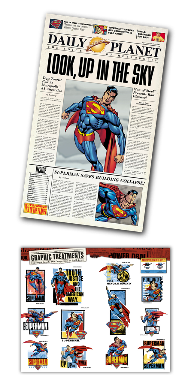
Past versions of the DC Comics Superman style guides were simple brochures. For the new version, DC Comics wanted to do something unique.
Our solution was to create a large style guide based on the "Daily Planet," the newspaper where Clark Kent works.
Cartoon Network
How to Train Your Dragon
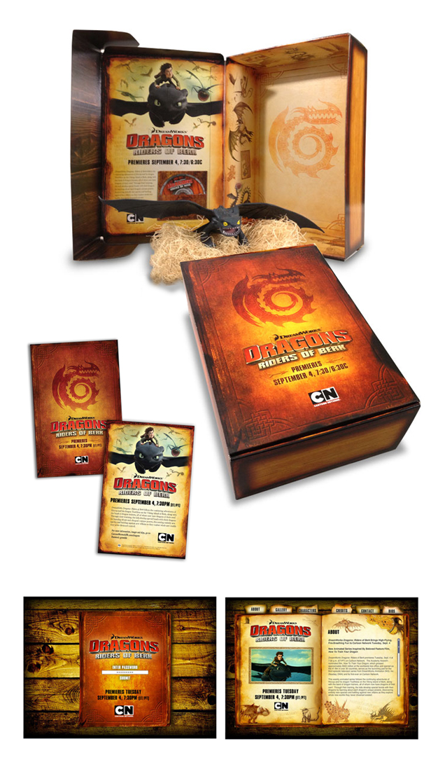
For DreamWorks/Cartoon Network's "How to Train Your Dragon" we designed a media kit box for their PR materials, screener DVD, and a toy dragon. The box was based "The Book of Dragons," a key element used by the show's main character.
We produced the large box to make it look like the book used in the TV show. The interior of the box was illustrated with beautiful illuminated manuscript style dragons.
Logos
Logo McLogoface
We can help your brand leave its mark.